“Press Card” Component
Design: zeplin.
Press cards are similar to article cards, but only have one size. On medium viewports, the card occupies 4 columns and on large viewports it occupies 3 columns.
Meet The Danish NGO That’s Taking Open-Source Education Global
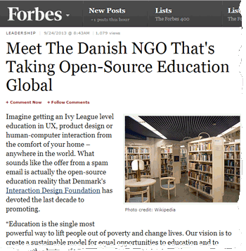
Education is the single most powerful way to lift people out of poverty and change lives. Our vision is to create a sustainable model for equal opportunities to education and to improve the design of technology. It is our vision to give ev…
Forbes.com
Meet The Danish NGO That’s Taking Open-Source Education Global
Education is the single most powerful way to lift people out of poverty and change lives. Our vision is to create a sustainable model for equal opportunities to education and to improve the design of technology. It is our vision to give ev…
Forbes.com
Usage
@include('components.cards.press', [
    'image' => 'https://public-media.interaction-design.org/images/screenshots_of_media_coverage/forbes_article.gif',
    'url' => 'http://www.forbes.com/sites/jmaureenhenderson/2013/09/24/meet-the-danish-ngo-thats-taking-open-source-education-global/',
    'title' => 'Meet The Danish NGO That’s Taking Open-Source Education Global',
    'subtext' => 'Forbes.com',
    'excerpt' => 'Education is the single most powerful way to lift people out of poverty and change lives.',
])
Props
-
image (required)string
Image url for the card.
-
url (required)string
Url to the external site.
-
title (required)string
Title of the press card (plaintext).
-
excerpt (required)string
Text content for press card (plaintext).
-
subtextstring
Text below the main excerpt (plaintext).