“Article Card” Component
Design: zeplin.
The article card features the hero image of the UX Daily article, with the article title laid over the image. The hero image is cropped and centered to fit the card’s size.
Small Card
Small Card take full width in small screen, 4 columns in medium screen and 3 in large screen. Title is in kilo type font.
How to Pair Fonts: A Practical Guide
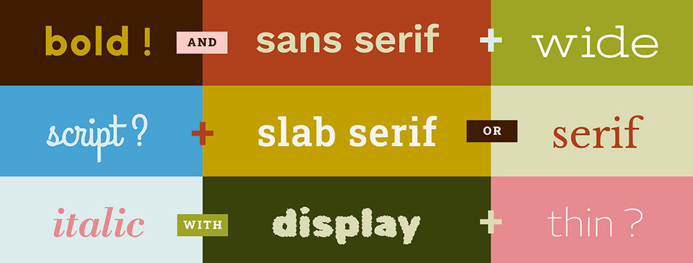
Nearly every designer working with type has a strong opinion on the right way to combine letterforms and pair fonts. Lik
- 350 shares
- 1 week ago
Your Gateway to UX Design: Norman Doors

It's probably happened to you. You've found the door to a building you were looking for but are having trouble getting i
- 320 shares
- 3 mths ago
Create a Winning UX/UI Portfolio: Optimize with AI
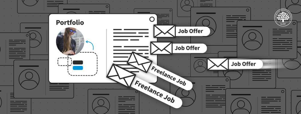
You're a designer. You've got talent, vision, and a lot of potential. But putting that portfolio together? It can be lik
- 435 shares
- 4 mths ago
Land That Job: What Top Design Leaders Really Look for in a Portfolio

Learn from the best—design experts reveal exactly what they look for in a portfolio. Get ready to transform your career
- 403 shares
- 5 mths ago
Large Card
Large Card take full width in small screen, 8 columns in medium screen and 6 in large screen. Title is in mega type font.
How to Pair Fonts: A Practical Guide
Nearly every designer working with type has a strong opinion on the right way to combine letterforms and pair fonts. Lik
- 350 shares
- 1 week ago
Usage
@include('components.cards.article', ['article' => $article])
@include('components.cards.article', ['article' => $article, 'large' => true])
Props
-
article (required)App\Modules\Publication\Models\Article
Article instance to display.
-
largebool
Becomes large card if true is passed.
Default Value:
false