“Article Card” Component
Design: https://zpl.io/brMNL1W.
The article card features the hero image of the UX Daily article, with the article title laid over the image. The hero image is cropped and centered to fit the card's size.
Small Card
Small Card take full width in small screen, 4 columns in medium screen and 3 in large screen. Title is in kilo type font.
9 Top Tips to Present Like a TED Speaker
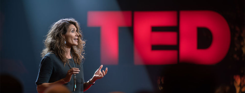
You have 18 minutes to change someone's mind. Maybe less. That's all TED gives its speakers, whether you're Bill Gates o
- 176 shares
- 1 week ago
Introverts Make Great Presenters: Here’s How You Turn Your Introversion into Your Superpower
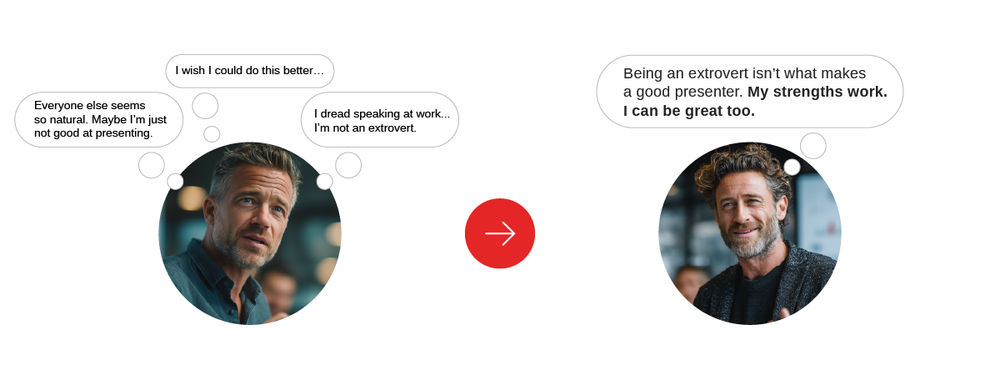
At some point, someone with a big personality took the stage, spoke confidently, made jokes, and walked away with applau
- 166 shares
- 2 weeks ago
This One Skill Gets You Hired, And It's Not What You Think

Simply matching a job description isn’t enough anymore. The right qualifications will get you considered for a position.
- 174 shares
- 2 weeks ago
How to Reframe Negative Feedback Without Losing Confidence in Yourself

Negative feedback hurts. There's no way around it. Your stomach drops, your heart beats faster, and your thoughts race:
- 224 shares
- 3 weeks ago
Large Card
Large Card take full width in small screen, 8 columns in medium screen and 6 in large screen. Title is in mega type font.
9 Top Tips to Present Like a TED Speaker
You have 18 minutes to change someone's mind. Maybe less. That's all TED gives its speakers, whether you're Bill Gates o
- 176 shares
- 1 week ago
Usage
@include('components.cards.article', ['article' => $article])
@include('components.cards.article', ['article' => $article, 'large' => true])
Props
-
article (required)App\Modules\Publication\Models\Article
Article instance to display.
-
largebool
Becomes large card if true is passed.
Default Value:
false